Orchid
A reading app that expands sentences into chunks.
- role
- Solo end to end Product design and User research
- timeline
- 1.5 weeks
- tools
- Figma , Claude
- platform
- Mobile
Introduction
“People can’t read anymore.”
That’s something I kept hearing whenever I tried to write content.
And as a curious designer, I asked: Why? What’s making people unable to read anymore?
Research
I started a research, I talked to Theo. Growing up, he was the kid who always had a book in hand. He used to spend hours reading his books, but now he told me he can’t read anymore. Reading became a hard thing, and he can’t get himself to do it.
He said that sometimes he wants to read; he really does, but he can’t.
This isn’t an isolated feeling. Millions of people are engaging with conversations about struggling to read. So I wanted to understand why. I started digging: articles, videos, existing research, anything that could explain what was happening. The research kept pointing to the same thing: hours of daily scrolling have quietly rewired how we consume content. We’ve trained our brains on an endless feed of low-effort videos, a new one every minute. Long-form now feels like a wall. Theo didn’t scroll TikTok as a teenager. He does now every day. The damage, per the research: short attention, no tolerance for length.
And reading needs exactly what scrolling destroyed: one thread of focus, held for a long time. Two opposite mental states.
Problem
Years of scrolling trained our brains to crave short, low-effort, endlessly new content, the exact opposite of what reading asks for.
How can I make long-form reading feel accessible again to people whose attention has been shaped by the feed?
Solution
I started by asking myself: Is there already an experience that makes long, demanding content feel easier to consume? It didn’t have to be a reading app, just something that helped people move through complex information without feeling overwhelmed.
Two experiences stood out.
The first was an AI tool that taught me a complex feature through a step-by-step walkthrough. The guide wasn’t short, but unlike traditional documentation filled with walls of text, it revealed information gradually. I stayed engaged and completed the entire walkthrough. The second was comic books. Beyond the illustrations, comics break text into small bubbles. You read one manageable piece at a time, yet somehow finish dozens of chapters in one sitting. Even after taking a break, it’s easy to return and continue.
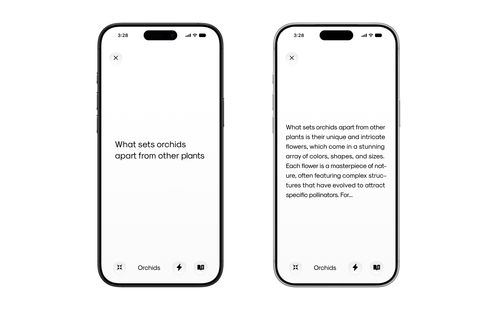
This connected with something I found in behavioural psychology: difficult habits become easier when they’re divided into small, clear actions. Instead of “study maths,” you begin by opening the book. Instead of completing a full lecture, you watch ten minutes. Reducing the size of the first step makes starting easier, and starting creates momentum. After several rounds of experimentation, I applied the same principle to reading. The experience begins with a single sentence. As the user scrolls, an interaction they already perform every day, new lines gradually appear until the screen becomes a full page. This gentle progression helps the user move from the mental state of scrolling into the deeper focus required for reading.
It also creates a natural sense of progress: the user begins with one line and ends with an entire page. To avoid making the experience feel too fast or frustratingly slow, users can control the pace or reveal words manually. Because reading requires focus, I kept the interface open and minimal, using generous white space and subtle glassmorphic controls.
I also added a compact mode that removes distractions during reading sessions.
The goal isn’t to make reading as addictive as scrolling. It’s to make starting feel easier, build momentum, and create a smoother transition into focused reading.
The idea may work, or it may not. So the next step is to define what success looks like and determine how it will be measured.
Screens
Testing
Because this solution has not yet been tested, I cannot assume that it will improve the reading experience. Success would be determined by whether the progressive reading interaction helps users move from the familiar habit of scrolling into a more focused reading state.
I would evaluate the solution by asking:
Do users find it easier to start reading?
Does beginning with one sentence feel less overwhelming than being presented with a full page of text?
Do users continue reading or complete more content?
Can users maintain enough momentum to read further or reach the end of a section?
Does the progressive reveal help users maintain focus?
Do users feel less distracted or mentally overwhelmed while reading?
Does the pace feel comfortable and controllable?
Can users adjust the reading speed or reveal more text manually without feeling rushed or restricted?
Do users feel a sense of progress?
Does moving from one line toward a full page make the reading task feel more achievable?
These questions would be measured through a combination of user behaviour and feedback. For example, I would look at how much content users complete, where they stop, whether they need to adjust the pace, and how they describe the experience afterwards.
I would not define success simply as making users read for longer. The solution would be successful only if it makes reading feel more approachable, helps users sustain focus, and gives them a stronger sense of control and progress. If users feel slowed down, frustrated, or distracted by the interaction, that would suggest that the solution needs to be reconsidered.