Anki
A redesign built around feedback.
- role
- Solo end to end Product designe
- timeline
- 1 Week
- tools
- Figma , Claude , Mobbin
- platform
- Mobile
Introduction
When I started learning Korean, one of my weak points was vocabulary, and one of the most recommended apps was Anki. So I downloaded it.
The first thing you see is an outdated UI. I looked past it, set up a deck, and ran my first session. And it delivered. Anki is genuinely good. But with every review, confusion kept building. It started with the feedback buttons. Finish a card, and Anki asks: how hard was it? Each button with a date stamped under it showing when you'll see the card next. Simple, supposedly. But card after card, the same questions looped in my head. Barely remembered, Hard or Again is it? Or Again over and over until it sticks? Am I even doing this right? I wasn't rating cards anymore. I was calculating schedules.
Research
First, I needed to understand what Anki actually is, the core. So I dug online and talked to people about how they use it. The variety surprised me: language learners like me, university students (med students especially) and even one guy prepping for his driving license exam.
Just like that, my assumption died. Anki wasn't a language-learning app. But killing one assumption opened a harder question: who am I designing for? The users came from everywhere, doing everything. Language learners? Med students? Because designing for each of them is a completely different job. I flipped my approach: I stopped sorting users by background, and started looking for what unites them.
So I looked at the app's core mechanic: flashcards powered by spaced repetition, a system built for retention. And there was my answer. Anki isn't a language app. It's a retention tool. My user isn't defined by background but by purpose: they all came to make information stay.
With the app and its users defined, I could finally hunt the problem.
So I’m thinking: the app asks how hard was it but the app exists to measure retention. Can a hardship scale measure retention? No. Retention isn’t about difficulty. If I ask you "did you remember this?", you don’t answer "yeah, medium level." You remembered, or you didn’t. Binary. And there it was: the app measures one thing while asking about another. That’s the problem.
Problem
Recalling a card is already a demanding mental act but Anki then asks users to translate that experience into a difficulty judgment, when all they actually know is whether they remembered.
How can I design feedback that removes the confusion and lets users give the right signal?
Solution
With the problem statement and the research in hand, the solution was clear. I knew what I needed to do.
We need to change the labeling from a hardship scale to a retention scale.
So what are the states of memory? Either you remembered, or you didn't. There's nothing else; those are the basics of memory. So that's what I did.
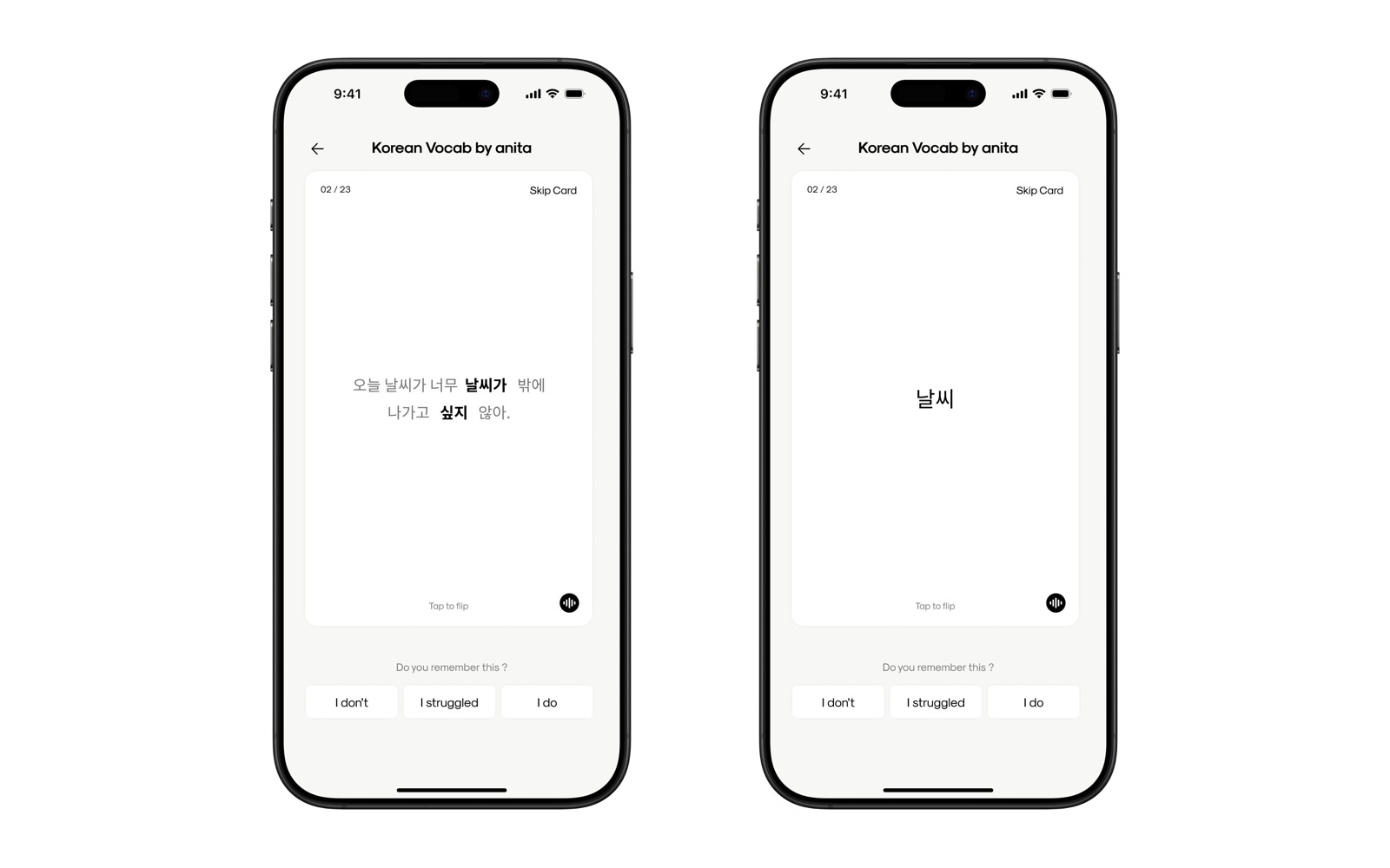
I tested it on myself. Reviewed a card, and now I want to give feedback: did I remember or not? I did... but it didn't feel like I remembered it well. I got to it, but it took a lot of time before I did. Not a straight remember, but not a didn't either. So I decided to add a feedback for that state: I struggled.
So now the feedback is clear. It's three states: remembered, didn't remember, and remembered but struggled.
And I tested it on myself, a deck of cards, going through: remembered this one, didn't remember that one, this one I struggled, this one I got.
And it was frictionless. The whole session, not a single moment of frustration.
Especially the "I struggled" button: it removed every "what should I click?" thought. Because with only two states, some cards would trap me: I struggled to get this one... so press "didn’t remember," just in case? But I did remember it, so "remembered"? That right there is friction. A feedback screen making me think this much is a feedback screen failing at its job. And that’s exactly what I needed to get rid of.
Screens
This is my redesign.
Testing
Because this solution has not yet been tested, I cannot assume that it will improve the review experience. Success would be determined by whether a retention-based scale removes the confusion I felt in my first session and lets users give a clear signal without thinking about it.
I would evaluate the solution by asking:
Do users answer with less hesitation?
Does the pause between seeing the answer and pressing a button get shorter when the labels describe memory instead of difficulty?
Do users know which button to press?
Can they choose without stopping to ask "which one is this?" or calculating what each option will do to the schedule?
Are their answers consistent?
When the same memory scenario is shown twice, do users pick the same button both times, and do different users pick the same one?
Does "I struggled" mean something specific?
Is it used for cards that were remembered with effort, or does it become a catch-all that replaces "Hard"?
Do users stop asking "Am I even doing this right?"
Does the review feel like remembering and answering honestly, instead of managing a system?
These questions would be measured through a combination of user behaviour and feedback. For example, I would look at how long users take to respond, how often they stop or ask for clarification, how consistently they rate the same scenarios, and how they describe the experience afterward. Each participant would review the same cards with both the original labels and the new ones, in alternating order, so the comparison stays fair.
I would not define success simply as faster reviews. The solution would be successful only if it makes the feedback feel clearer, produces more consistent answers, and removes the sense of doing math between cards. If users hesitate just as much, disagree on what "struggled" means, or treat it as the new "Hard", that would suggest the solution needs to be reconsidered.
A short session can show whether the labels are clearer, but not whether they improve long-term retention. That would need to be tested over weeks of real use, and it is the next question to answer.